Advertisement
When working with information, not everything fits into neat categories like "yes" or "no." Sometimes, we deal with things that have a clear order but not an exact difference between them. That’s where ordinal data steps in. It’s the type of data that helps us rank and organize things in a meaningful sequence without getting tangled up in precise measurements. Understanding how it works and where to use it can make a real difference, whether you're gathering survey responses, studying customer feedback, or sorting out performance levels.
Imagine filling out a restaurant survey. You might be asked to rate your experience as excellent, good, fair, or poor. These answers have a natural order — excellent is better than good, good is better than fair, and so on — but you can't say exactly how much better one is than the other. That's the heart of ordinal data. It gives you a sense of ranking but doesn't spell out the distance between ranks.
Ordinal data sits comfortably between two other familiar types: nominal data (which labels things without any order) and interval data (which deals with measurable, equally spaced differences). Think of it as the middle child of the data family — organized but not obsessed with the numbers.

You might not realize it, but ordinal data shows up everywhere. A few examples:
In each case, there’s a natural ranking. However, we can’t say the jump from "good" to "excellent" is the same as the jump from "fair" to "good." That’s the tricky but fascinating part about working with ordinal information.
When you're planning to gather ordinal data, it's all about crafting choices that feel natural and ordered. Open-ended questions won't do here; you need structured responses that flow logically from one option to the next.
A few ideas:
Use consistent scales: Whether you pick 1–5 or "strongly agree" to "strongly disagree," keep the intervals intuitive.
Avoid confusing overlap: Make sure each choice feels distinct. No one should be stuck wondering if they fall between "good" and "very good."
Stick to the order: List options in the natural sequence people expect, from highest to lowest or vice versa.
If you build your surveys or assessments with these ideas in mind, you’ll get cleaner, easier-to-understand data that actually reflects what people think or feel.
Sometimes, people treat ordinal data like numerical data and try to perform operations that don't make sense. For instance, calculating the average ranking can give misleading results. Always remember: ordinal data shows order, not exact value.
Another common slip-up is overloading the options. If a pain scale has twelve levels instead of five, it may confuse people instead of helping them. Stick to straightforward, manageable categories.
Once you’ve collected ordinal data, what comes next? You won’t be running typical averages or applying complex formulas, but you still have some effective ways to make sense of it.
The median — the middle value when all responses are lined up — works beautifully for ordinal data. It tells you where most responses center without pretending there’s a precise numeric difference between ranks.
The mode — the most frequently selected option — is equally useful. If "satisfied" shows up more than any other choice on a customer survey, that gives you clear insight into general sentiment.
When you want to dig a little deeper, cross-tabulation can help. This method lets you compare how different groups responded. For example, you might find that customers under 30 rated your service as "excellent" more often than customers over 50. That’s a valuable discovery, and it’s all built on simple, smart comparisons.
If you’re feeling a little more technical, there are special statistical tests designed just for ordinal data. Tests like the Mann-Whitney U or the Kruskal-Wallis can help you compare groups without assuming a normal distribution. These tools stay true to the spirit of ordinal data — respecting order without forcing assumptions about the gaps between categories.
There are some fields where ordinal data doesn’t just help — it’s almost the whole story. Knowing where it shines can help you make better decisions about when and how to use it.
Customer satisfaction, brand loyalty, and product preference — all of these areas rely heavily on ordinal data. When people are asked to rank or rate their experiences, ordinal scales give companies a snapshot of how well they are meeting expectations.

Surveys that ask customers to "rank these features from most to least important" provide companies with practical, easy-to-apply feedback. No complicated formulas are needed — just clear, actionable insights based on order.
Pain scales, depression inventories, mobility ratings — medical professionals often lean on ordinal data to understand their patients. It’s quick, respectful of the patient’s perspective, and flexible enough to apply in a variety of situations without forcing numbers where they don’t belong.
Whether it’s grading essays with rubrics (excellent to poor) or evaluating employee performance (outstanding to unsatisfactory), ordinal data helps organize subjective judgments into structured, usable results. It brings clarity without pretending every "good" is exactly 7.3 points better than every "fair."
When you understand what ordinal data is — and what it isn’t — you unlock a simple but powerful way to organize information. It captures the natural order of things without forcing us into awkward measurements. Whether you're building a customer survey, evaluating medical treatments, or just trying to organize your own thoughts, using ordinal data thoughtfully can lead to better insights and smarter decisions.
The trick is always to respect order while remembering that the gaps are unknown. Treat it like the ranking it is, not a ruler you can stretch and pull. Do that, and ordinal data becomes a straightforward, reliable tool in your toolkit.
Advertisement
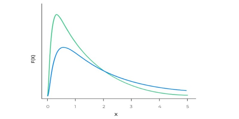
Ever wonder why real-world data often has long tails? Learn how the log-normal distribution helps explain growth, income differences, stock prices, and more

Working with rankings or ratings? Learn how ordinal data captures meaningful order without needing exact measurements, and why it matters in real decisions

From training smarter AI to protecting privacy, synthetic data is fueling breakthroughs across industries. Find out what it is, why it matters, and where it's making the biggest impact right now

Learn what vector databases are, how they store complex data, and why they're transforming AI, search, and recommendation systems. A clear and beginner-friendly guide to the future of data storage

Looking for a laptop that works smarter, not harder? See how Copilot+ PCs combine AI and powerful hardware to make daily tasks faster, easier, and less stressful

Think data science is just coding? See how math shapes predictions, decisions, and the models that power everything from apps to research labs
Apple unveiled major AI features at WWDC 24, from smarter Siri and Apple Intelligence to Genmoji and ChatGPT integration. Here's every AI update coming to your Apple devices
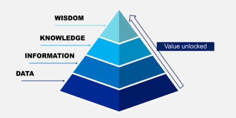
Ever wondered how facts turn into smart decisions? Learn how the DIKW Pyramid shows the journey from raw data to wisdom that shapes real choices

The Dead Internet Theory claims much of the internet is now run by bots, not people. Find out what this theory says, how it works, and why it matters in today’s online world

Get a clear overview of Google's seven Gemini AI models—each built with a unique purpose, from coding assistance to fast response systems and visual data understanding

Wondering if there’s an easier way to add up numbers in Python? Learn how the sum() function makes coding faster, cleaner, and smarter

Explore the top 8 AI travel planning tools that help organize, suggest, and create customized trip itineraries, making travel preparation simple and stress-free